需求
答题、问卷形式的活动经常用到的环形倒计时。进度条通常都是长条,有时候也有环形进度条的需求。倒计时是从有到无,相反的,进度条从无到有。实现方式差不多。
实现思路
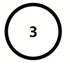
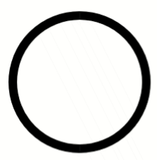
如果只是实现一个圆环,可以这样写
1
2
3
4
5
6
7
8
9

<style type="text/css">
  .circle {
    width : 200px;
    height : 200px;
    border: 12px solid #000;
    border-radius : 50%;
  }
</style>
<div class="circle"></div>
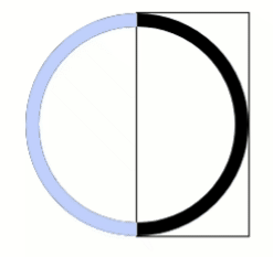
但是它一直是一个闭环,为了实现从完整的圆环逐渐减少至消失,css中有两种方案一个是消失display:none;,另一个是隐藏。这种情况下,消失不适用。那么就是隐藏了,隐藏有两种,一种是真的隐藏了,另一种是被遮住了。这里用到了overflow: hidden;超出的部分隐藏和遮住达到隐藏的效果。
最终思路如下:
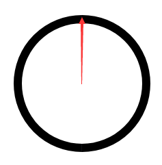
- 把整个圆环分成左右两部分。要从箭头处开始覆盖,可以写个半圆,先把这个半圆旋转到矩形的另一边隐藏起来,然后再慢慢改变这个半圆环的角度,让它显示出来。
- 左右两部分都有半个圆环在旋转,比如先让右边的半圆环,旋转结束,然后左边的半圆环开始旋转。
实现过程
上面写的思路可能比较抽象,下面结合代码和图尽量详细说明一下。
1.先实现右半圆
1
2
3
4
5
6
7
8

.circle__right {
  width : 200px;
  height : 200px;
  border: 12px solid transparent;
  border-top: 12px solid #bfd1ff;
  border-right: 12px solid #bfd1ff;
  border-radius : 50%;
}
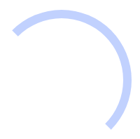
因为是border-top和border-right,这样写出来的半圆如上图。没关系,transform: rotate(-135deg);旋转-135度,正好能隐藏半个圆。然后再加上动画,旋转45度时正好能显示半个圆。
2.加上动画
1
2
3
4
5
6
7
8
9
10
11
12
13
14
15
16
17
18

.circle__right {
  width : 200px;
  height : 200px;
  border: 12px solid transparent;
  border-top: 12px solid #bfd1ff;
  border-right: 12px solid #bfd1ff;
  border-radius : 50%;
  transform: rotate(-135deg);
  animation: circle__right 3s linear infinite;
}
@keyframes circle__right {
  50% {
    transform: rotate(45deg);
  }
  100% {
    transform: rotate(45deg);
  }
}
再通过overflow: hidden;隐藏矩形框以外的部分,矩形的区域里就实现了倒计时的效果。这样右半圆的效果就实现啦,左半圆的实现也同理。
1
2
3
4
5
6
7
8
9
10
11
12
13
14
15
16
17
18
19
20
21
22
23
24
25
26
27
28
29
30
31
32
33
34
35
36
37
38
39
40
41
42

<style type="text/css">
  .circle {
    position: relative;
    height: 200px;
    width: 200px;
    border: 12px solid #000;
    border-radius: 50%;
  }
  .right {
    position: absolute;
    top: 0;
    right: 0;
    width: 100px;
    height: 200px;
    overflow: hidden;
  }
  .circle__right {
    position: absolute;
    top: 0;
    right: 0;
    height: 200px;
    width: 200px;
    border: 12px solid transparent;
    border-top: 12px solid #bfd1ff;
    border-right: 12px solid #bfd1ff;
    border-radius: 50%;
    transform: rotate(-135deg);
    animation: circle__right 3s linear infinite;
  }
  @keyframes circle__right {
    50% {
      transform: rotate(45deg);
    }
    100% {
      transform: rotate(45deg);
    }
  }
</style>
<div class="circle"></div>
<div class="right">
  <div class="circle__right"></div>
</div>
源码和demo
1
2
3
4
5
6
7
8
9
10
11
12
13
14
15
16
17
18
19
20
21
22
23
24
25
26
27
28
29
30
31
32
33
34
35
36
37
38
39
40
41
42
43
44
45
46
47
48
49
50
51
52
53
54
55
56
57
58
59
60
61
62
63
64
65
66
67
68
69
70
71
72
73
74
75
76
77
78
79
80
81
82
83
84
85
86
87
88

  <style type="text/scss">
  .bar--circle {
      position: relative;
      height: 200px;
      width: 200px;
      border-radius: 100%;
      .num {
          position: absolute;
          top: 50%;
          left: 50%;
          font-size: 50px;
          font-weight: bold;
          transform: translate(-50%,-50%);
      }
      .circle {
          position: relative;
          height: 200px;
          width: 200px;
          border: 12px solid #000;
          border-radius: 50%;
      }
      .right {
          position: absolute;
          top: 0;
          right: 0;
          width: 100px;
          height: 200px;
          overflow: hidden;
          .circle__right {
              position: absolute;
              top: 0;
              right: 0;
              height: 200px;
              width: 200px;
              border: 12px solid transparent;
              border-radius: 100%;
              border-top: 12px solid #bfd1ff;
              border-right: 12px solid #bfd1ff;
              transform: rotate(-135deg);
              background-clip: padding-box;
          }
      }
      .left {
          position: absolute;
          top: 0;
          left: 0;
          width: 100px;
          height: 200px;
          overflow: hidden;
          .circle__left {
              position: absolute;
              top: 0;
              left: 0;
              height: 200px;
              width: 200px;
              border: 12px solid transparent;
              border-left: 12px solid #bfd1ff;
              border-bottom: 12px solid #bfd1ff;
              border-radius: 100%;
              transform: rotate(-135deg);
          }
      }
      &.restart {
          .circle__right {
              animation: circle__right 3s linear infinite;
          }
          .circle__left {
              animation: circle__left 3s linear infinite;
          }
      }
      &.pause {
          .circle__left,
          .circle__right {
              animation-play-state: paused;
          }
      }
  }
  </style>
	<div class="bar--circle">
		<div class="circle"></div>
		<div class="left">
			<div class="circle_left"></div>
		</div>
		<div class="right">
			<div class="circle_right"></div>
		</div>
	</div>
扩展-渐变边框的实现
3月的时候,新需求用到了这个组件。但是设计了渐变的背景,如图。
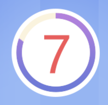
因为border的颜色不能用linear-gradient,可以将渐变的这部分用其他方式实现。 在在父容器用background: linear-gradient,先实现一个渐变的圆,然后子元素border: 12px solid transparent; 和 background-clip: padding-box; padding-box是指从padding区域(不含padding)开始向外裁剪背景。这样子元素的border区域显示的就是背景的渐变,从而实现渐变边框。
1
2
3
4
5
6
7
8
9
10
11
12
13
14
15
16
17
18
19
20
21

<style type="text/scss">
.bar--circle {
  position: relative;
  height: 200px;
  width: 200px;
  border-radius: 100%;
  background: linear-gradient(#697ad9,#b483de);
}
.circle {
    position: relative;
    height: 200px;
    width: 200px;
    background: #fff;
    border: 12px solid transparent;
    border-radius: 50%;
    background-clip: padding-box;
}
</style>
<div class="bar--circle">
  <div class="circle"></div>
</div>
后记-SVG实现
除了以上的方式实现环形倒计外,其实还可以用SVG来实现,而且使用SVG的实现性价比更高。大致思路:
1
2
3
4
5
6
7
8
9
10
11
12
13
14
15
16
17

<style>
  circle {
    -webkit-transition: stroke-dasharray .25s;
    transition: stroke-dasharray .25s;
  }
</style>
<svg width="440" height="440" viewbox="0 0 440 440">
    <circle cx="220" cy="220" r="170" stroke-width="50" stroke="#D1D3D7" fill="none"></circle>
    <circle cx="220" cy="220" r="170" stroke-width="50" stroke="#00A5E0" fill="none" transform="matrix(0,-1,1,0,0,440)" stroke-dasharray="0 1069"></circle>
</svg>
<script type="text/javascript">
var range = document.querySelector("#range"), circle = document.querySelectorAll("circle")[1];
if (range && circle) {
  var percent = 30 / 100, perimeter = Math.PI * 2 * 170;
  circle.setAttribute('stroke-dasharray', perimeter * percent + " " + perimeter * (1- percent));
}
</script>